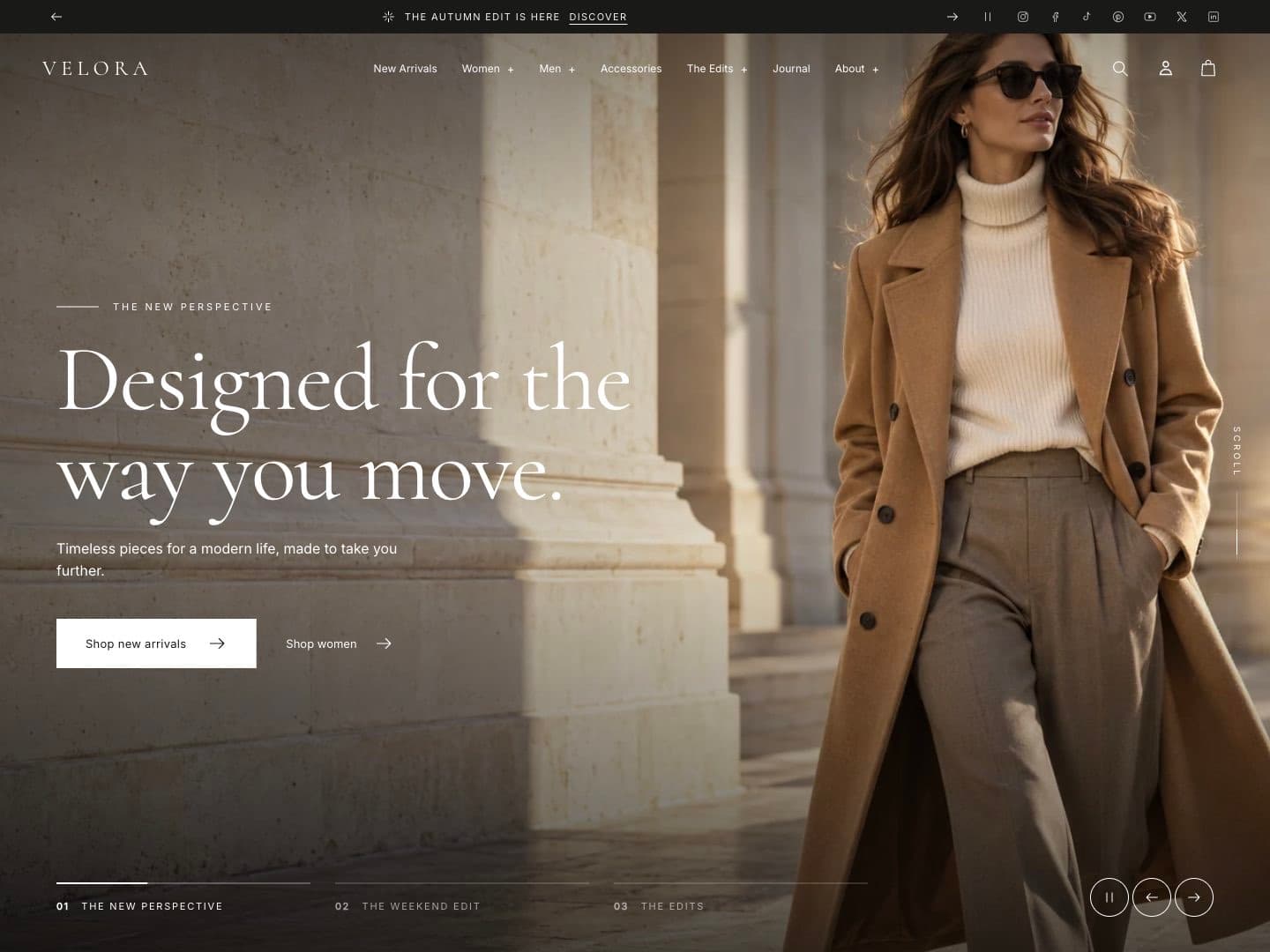
Header and navigation
The header group contains the Announcement bar and the Header. Edit them on any page in the theme editor.
Menus
Ani uses the menus from Online Store › Navigation.
- Main menu: top-level links appear in the header. Links nested under a top-level link appear in its mega menu or drop-down; a third level is supported.
- Customer account menu: links shown for signed-in customers.
Link menu items to collections (not plain URLs) where you can. Ani then shows collection photos and featured products in the mega menu automatically.
Header settings
| Setting | What it does |
|---|---|
| Desktop menu type | Mega menu, Dropdown or Drawer. Mobile and tablet always use the drawer. |
| Uppercase menu links | Shows top-level links in capitals. |
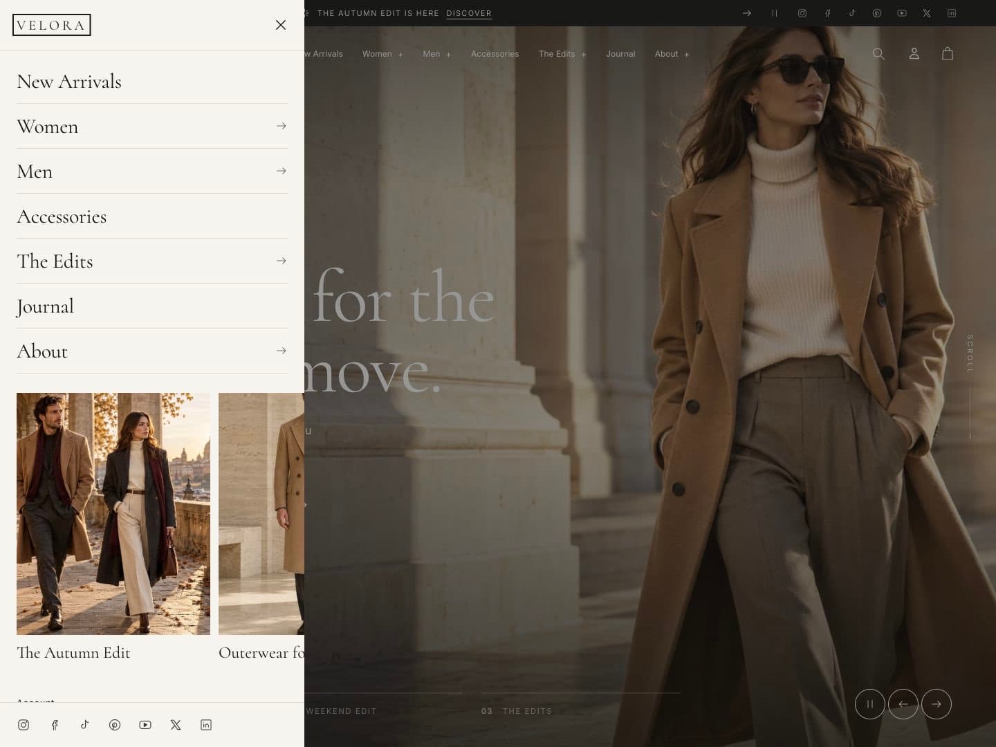
| Navigation editorial image | An image shown in the mobile menu drawer. |
| Show collection images in mega menu | Shows a photo tile for child links that point to collections. |
| Products in mega menu | 0–4 featured products in each mega menu panel. Set 0 to hide them. |
| Header on scroll | Static, Sticky, or Reveal on scroll up. |
| Logo position | Left or center on desktop. |
| Header width | Page width or full width. |
| Logo width | Size of the logo image. |
| Transparent over homepage hero | Lets the header sit over a full-image hero or slideshow at the top of the home page. |
| Transparent header text | Text color used while the header is transparent. |
| Show search / account icons | Shows or hides these header icons. |
| Show country and language selectors | Shows selectors when you sell in several markets or languages. |
The transparent header only applies when the first section of the home page is a full-image Hero or a Slideshow. It becomes solid when the visitor scrolls or opens the menu.
Mega menu
Each mega menu panel combines:
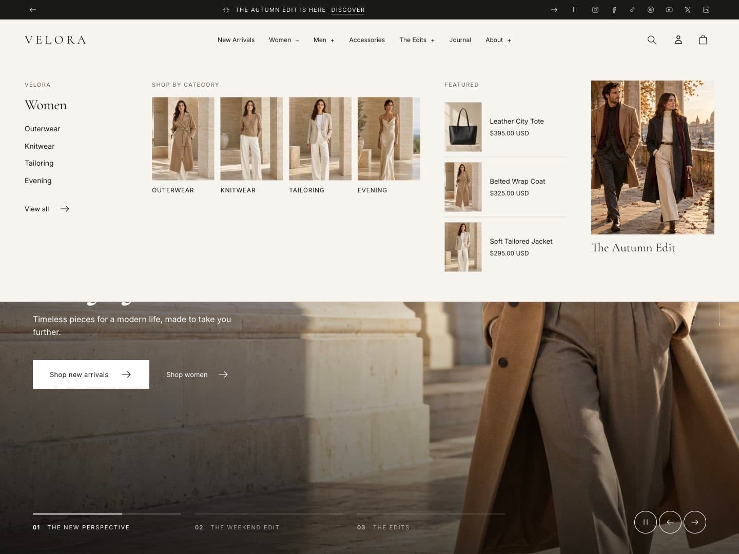
- the child links of the top-level item, with their own child links;
- Shop by category tiles for child links that point to collections;
- up to four featured products from the top-level item’s collection;
- a matching Menu promotion block, if you added one.
Panels open on hover with a mouse and on click or Enter with touch and keyboard. Escape closes them. On screens narrower than 1200 px the products column is hidden.
Menu promotion blocks
Add a Menu promotion block to the Header to feature a product or collection inside a menu panel.
| Setting | What it does |
|---|---|
| Menu item title | The exact title of the top-level menu link this promotion belongs to, for example Women. |
| Featured collection / Featured product | What to promote. A product takes priority over a collection. |
| Editorial image override, Heading override, Link override | Replace the image, title or destination. |
Promotions also appear as cards in the mobile menu drawer.
Mobile menu drawer
On phones and tablets, the menu opens as a drawer. Top-level links open sliding panels with collection photo tiles, featured products and the matching promotion. Social links and country/language selectors sit at the bottom.
Announcement bar
See Promotions › Announcement bar.