Sections
Sections are the building blocks of every page. Add them in the theme editor with Add section, then fill in their settings and blocks.
Settings most sections share
| Setting | What it does |
|---|---|
| Eyebrow, Heading, Heading size | The small label, title and title size above the section content. |
| Color scheme | Which of your color schemes the section uses. |
| Section width | Theme width, narrow or full width. |
| Customize vertical spacing | When on, set top and bottom spacing separately for desktop and mobile. |
| Show as slider | Turns a grid into a slider, with items per view, auto-rotate, interval and a progress bar. |
Auto-rotating sliders pause on hover, on keyboard focus and when the tab is hidden, always include a pause button and do not move for visitors who prefer reduced motion.
Hero and banners
| Section | Use it for | Setup notes |
|---|---|---|
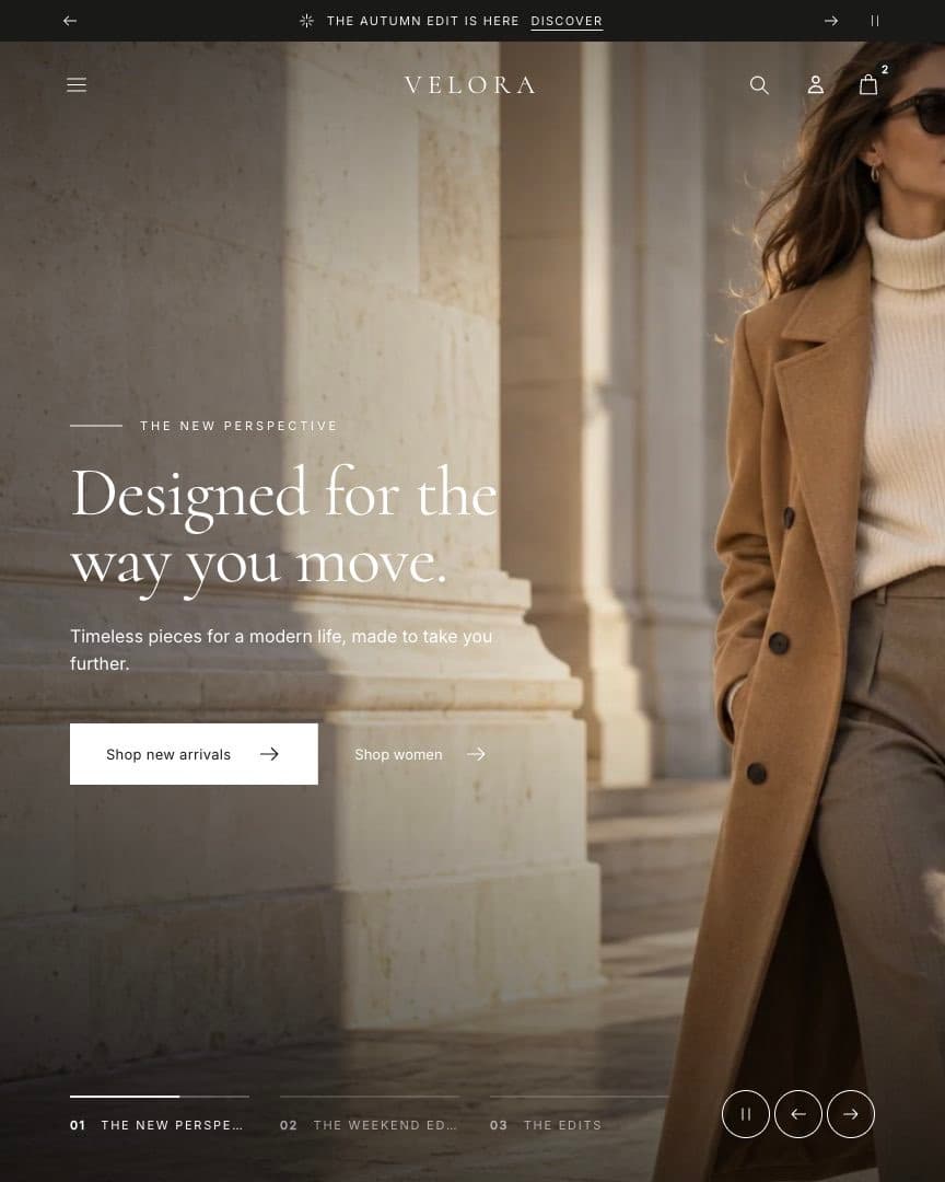
| Slideshow | A full-width carousel at the top of the page. | Add Slide blocks with desktop and mobile images. Style: Cinematic fills the screen with stacked slides, word-by-word headlines and chapter progress; Classic is a simple slider. Set an accessible name for screen readers. |
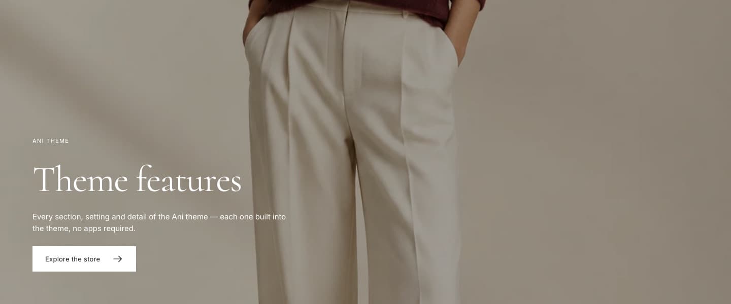
| Hero | One large image or video with a headline. | Compositions: split, full image, inset and cinematic. Add a mobile image and choose its crop. Optional second button and countdown. |
| Image banner | A shorter banner between sections. | Optional mobile image and countdown. Turn on Use heading as page title (H1) only if it is the main heading of the page. |
| Marquee | Scrolling text strip. | Add Text blocks; set separator, speed and pause on hover. |

Collections and products
| Section | Use it for | Setup notes |
|---|---|---|
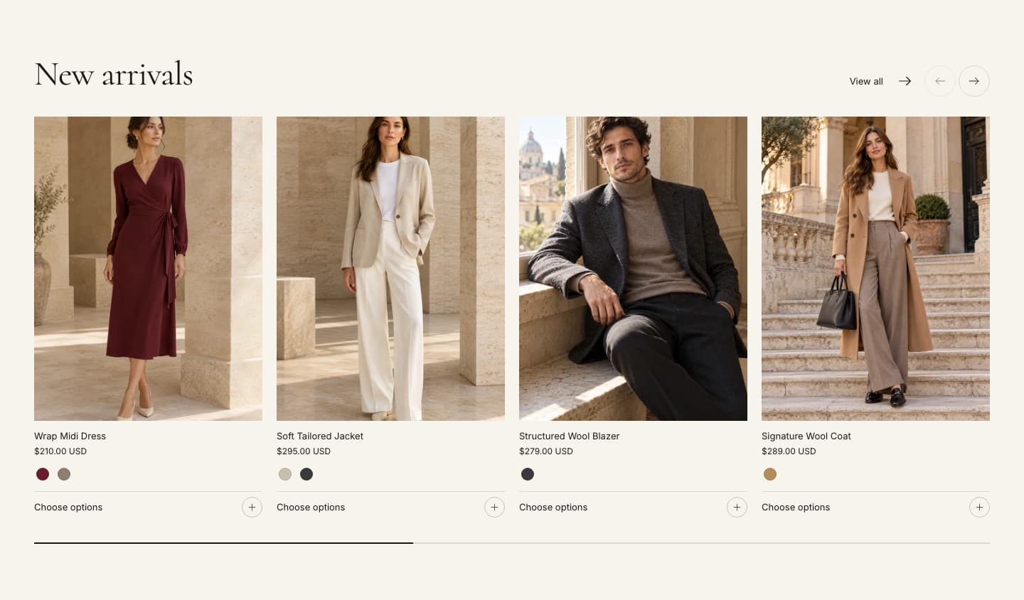
| Featured collection | A grid or slider of products from one collection. | Choose the collection and product count. Image ratio and fit can override the global product card setting. |
| Collection list | Pick collections to show as cards. | Card style is set in Theme settings › Collection cards. |
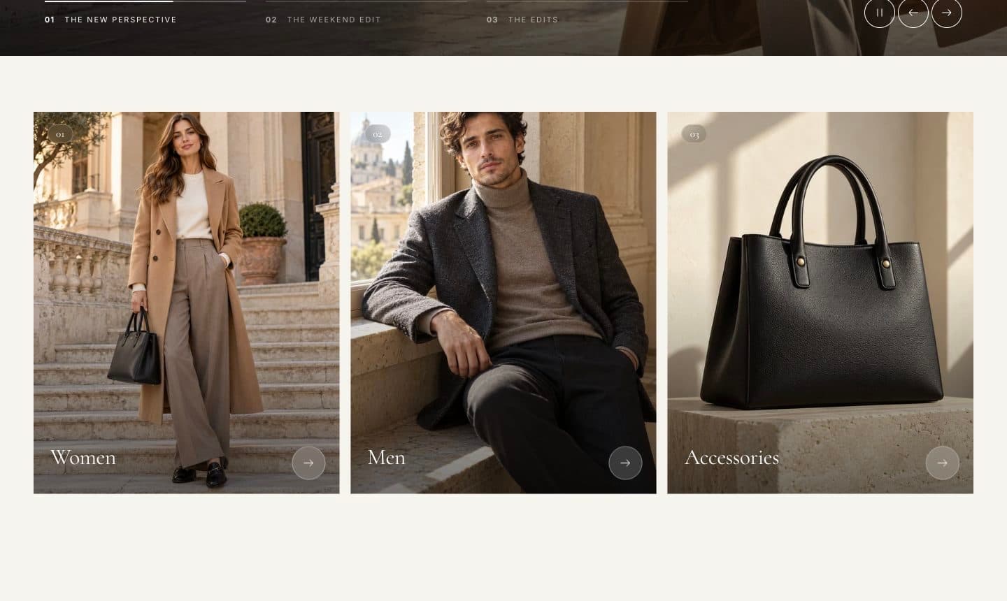
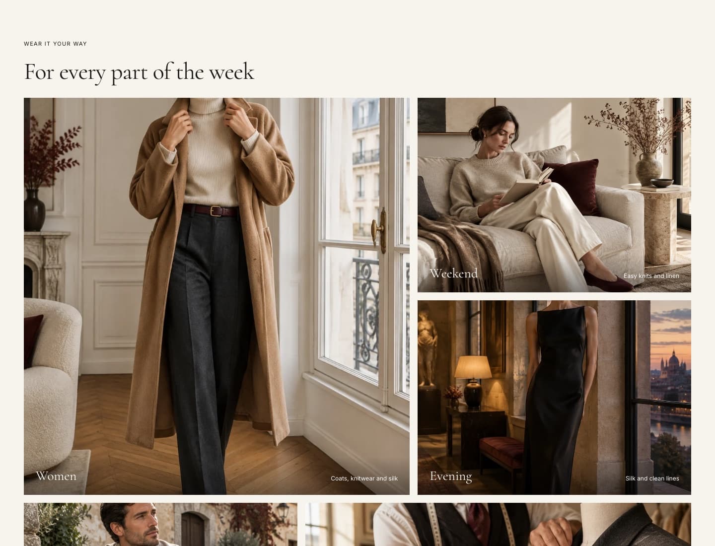
| Category cards | Editorial tiles that link to collections. | Add Category blocks with your own images. |
| Collection feature | One collection beside a large image. | Uses the collection image unless you set an override. |
| Featured product | One product with gallery and add to cart. | Supports app blocks and a Custom Liquid block. |
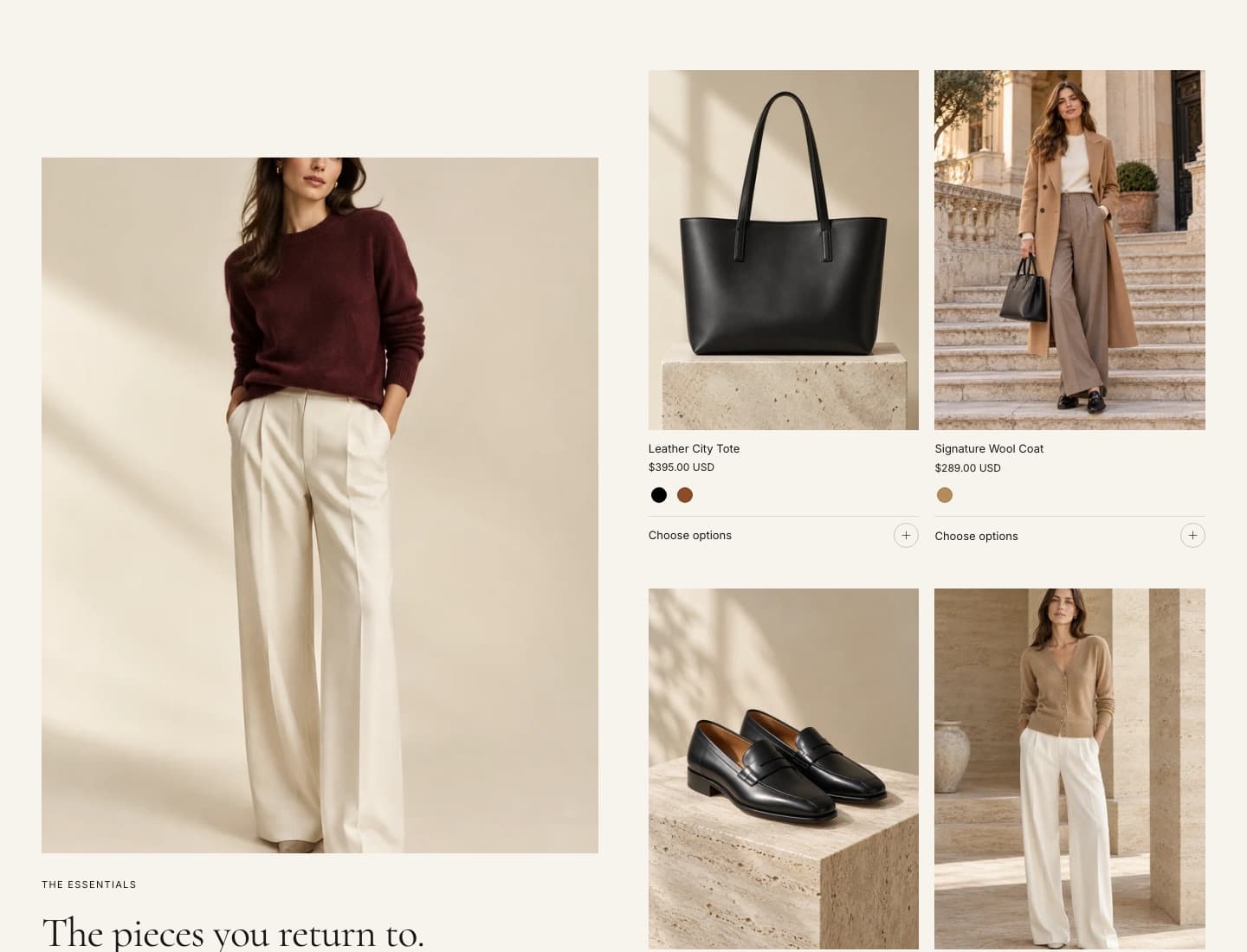
| Product list | A hand-picked list of products. | Grid or list layout. |
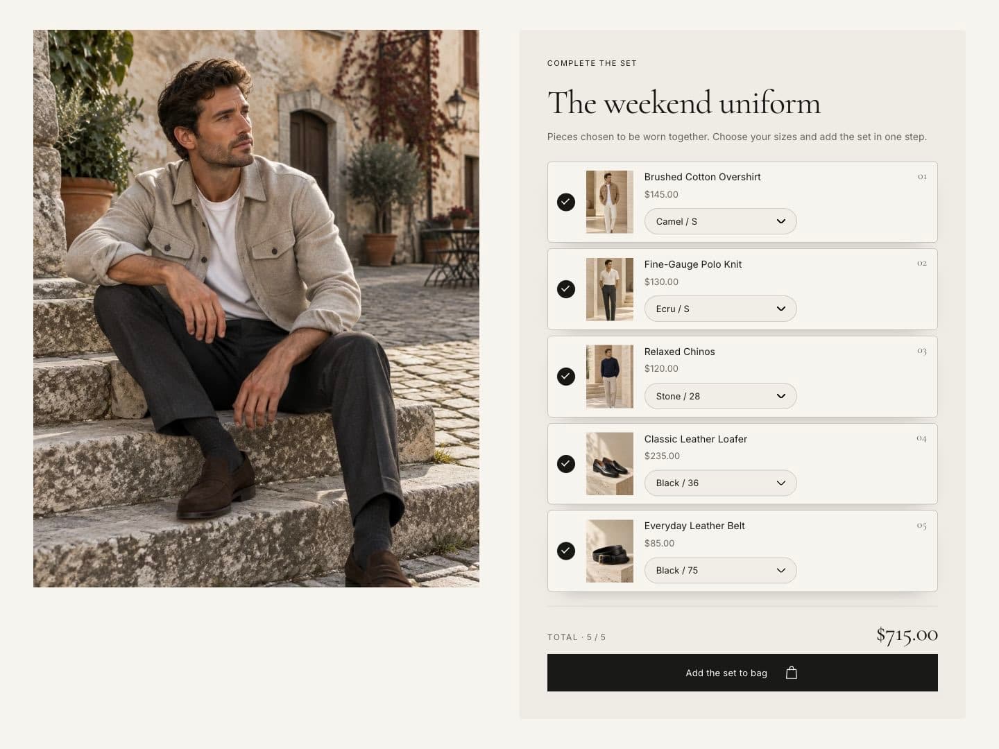
| Product bundle | Several products bought together. | Customers tick products and add them in one click; the total updates. |
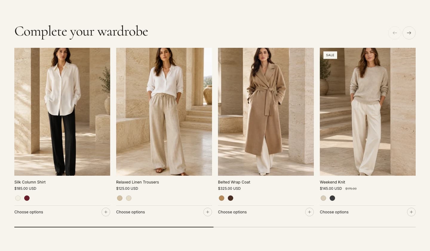
| Recommendations | Related or complementary products. | Products come from Shopify’s recommendations. Shows nothing if Shopify has no recommendations. |
| Recently viewed products | Products the visitor viewed before. | Stored in the visitor’s browser only. |
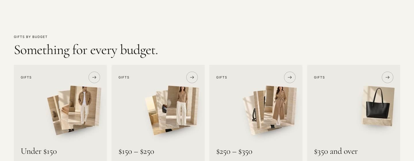
| Shop by price | Price-range tiles that open a filtered collection. | Requires the Price filter in Search & Discovery. Labels use your store currency. |
Guided selling
| Section | Use it for | Setup notes |
|---|---|---|
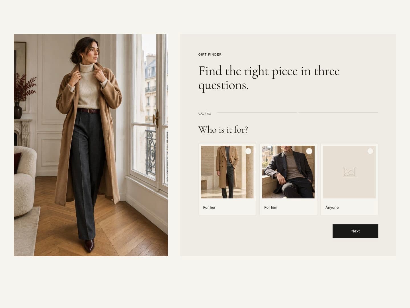
| Product finder | A short quiz that recommends products. | Up to six Question blocks with up to four answers each. Each answer maps to a product tag; results are tagged products from the chosen collection. Leave a tag empty to match any product. |
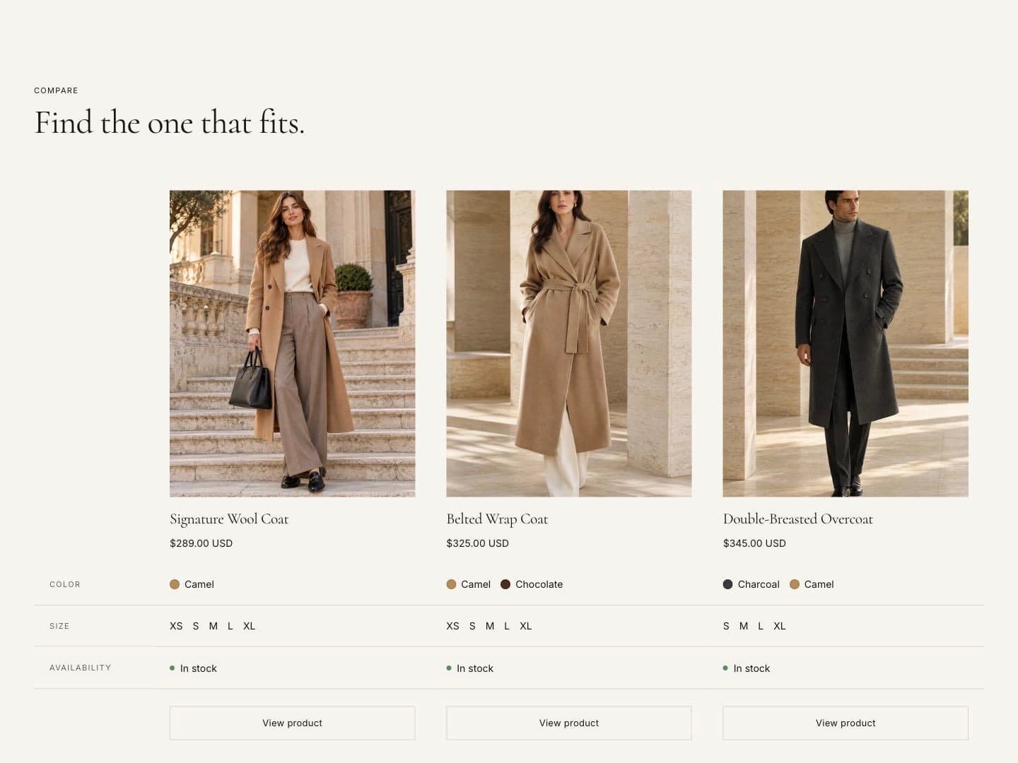
| Product comparison | Up to four products side by side. | Add Product blocks. One per line in Rows: an option name (Color) or a product metafield as Label: namespace.key. Mark one product as recommended. |
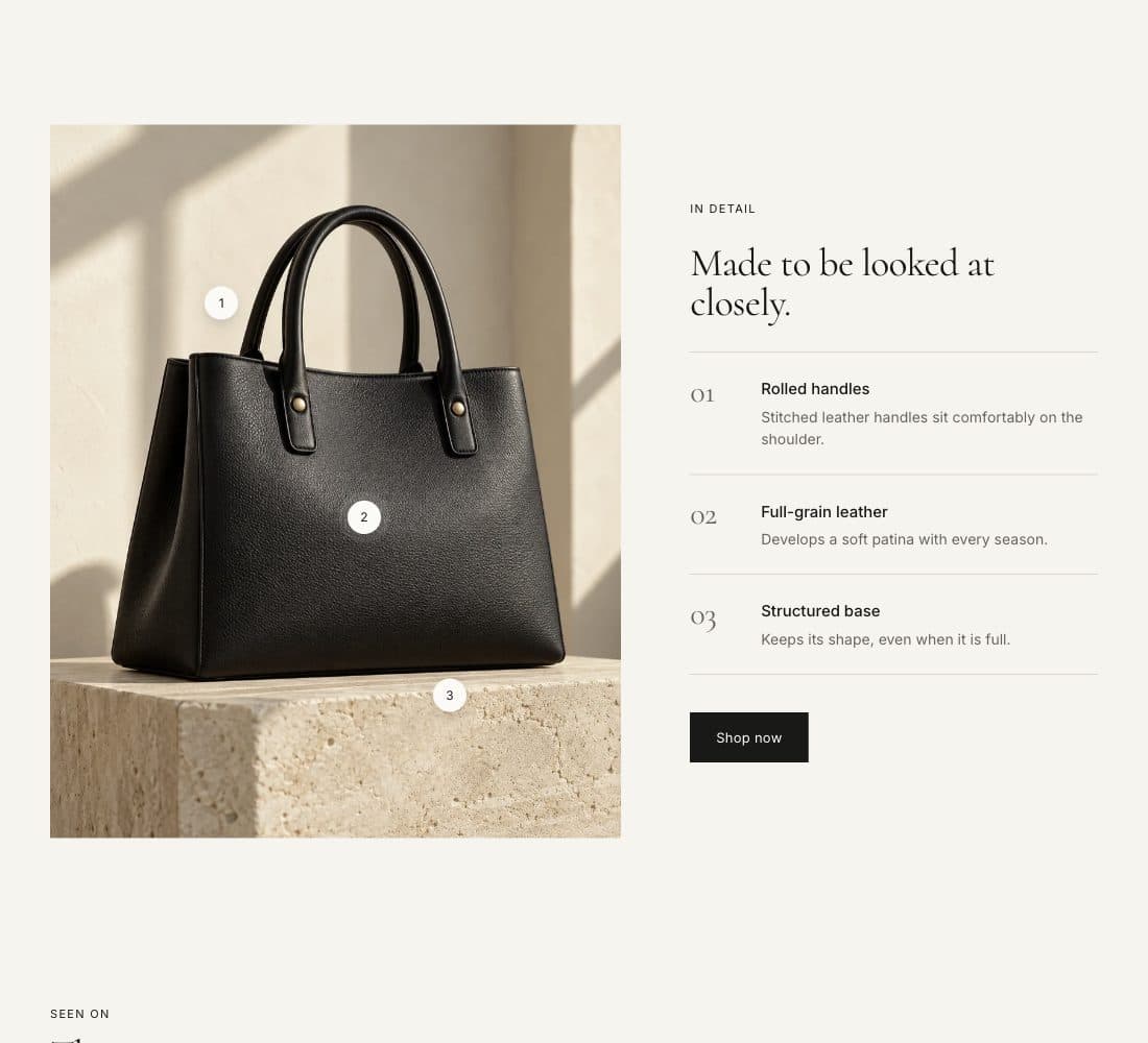
| Feature hotspots | Explain the details of one product. | Add Feature blocks with horizontal and vertical position; notes are listed beside the image. |
| Size guide | A size chart with fit tips. | Link a page with measurements; add Fit tip blocks. |
Shoppable content
| Section | Use it for | Setup notes |
|---|---|---|
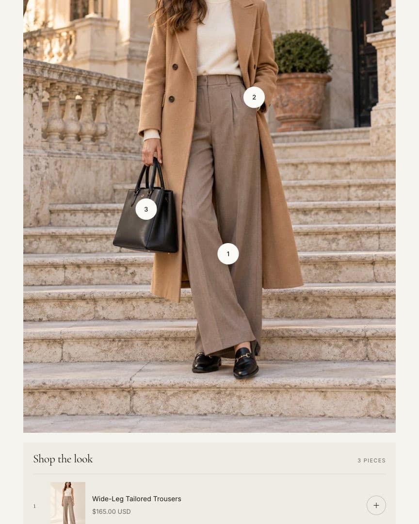
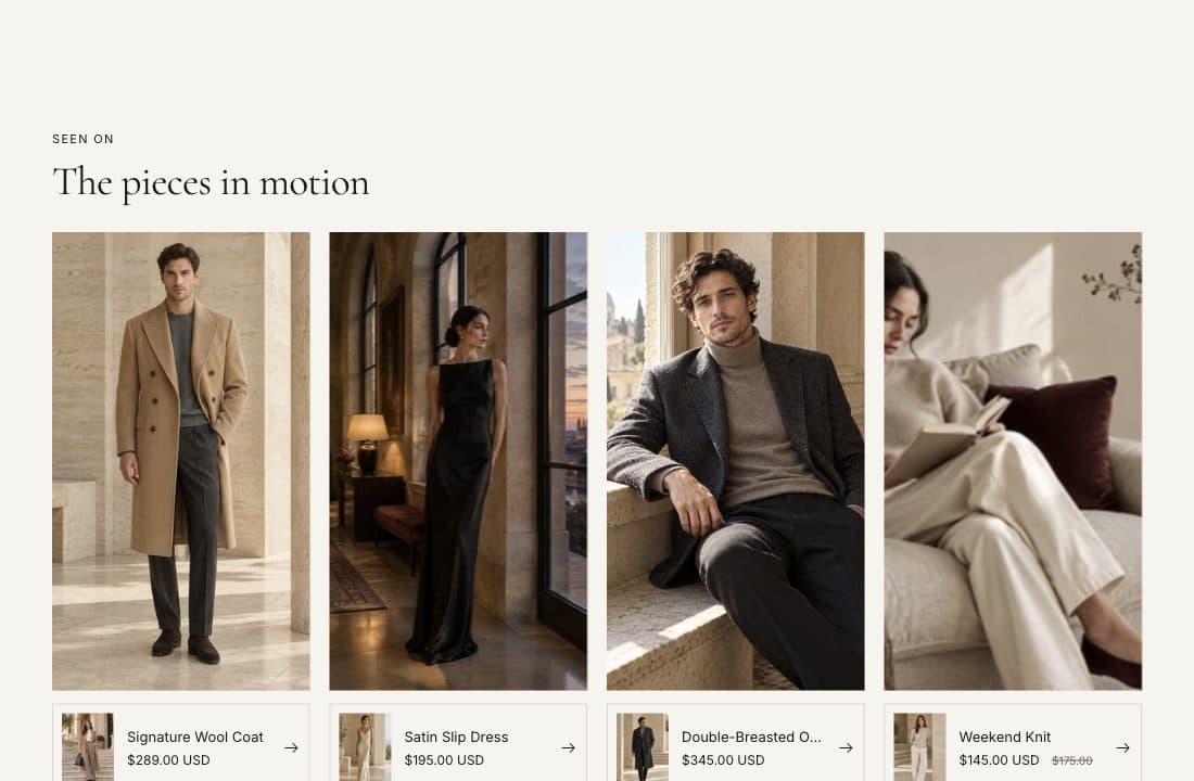
| Shop the look | A scene with products on it. | Add Product hotspot blocks and position them. Optional product rail with a look total. |
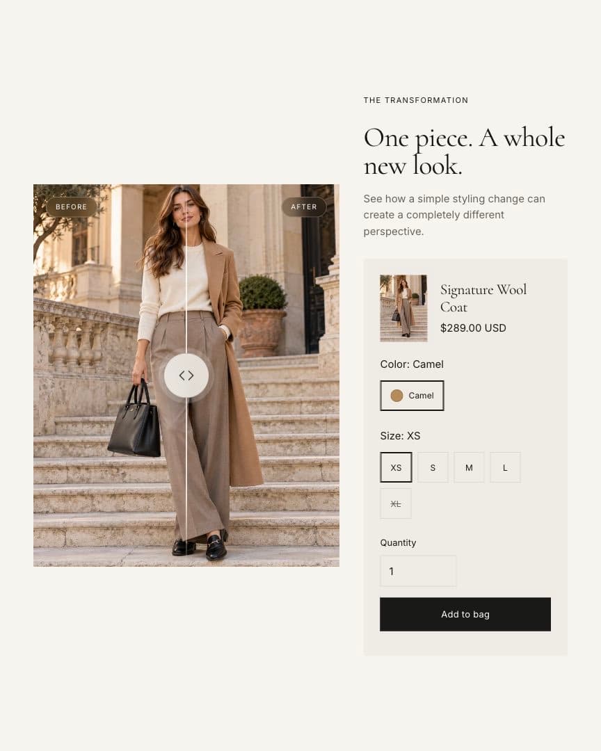
| Before/after | Compare two images with a slider. | Use two images with the same size and framing. Optionally connect a product to add to cart. |
| Shoppable videos | Short vertical videos with products. | Add Video blocks with a video and a product. |
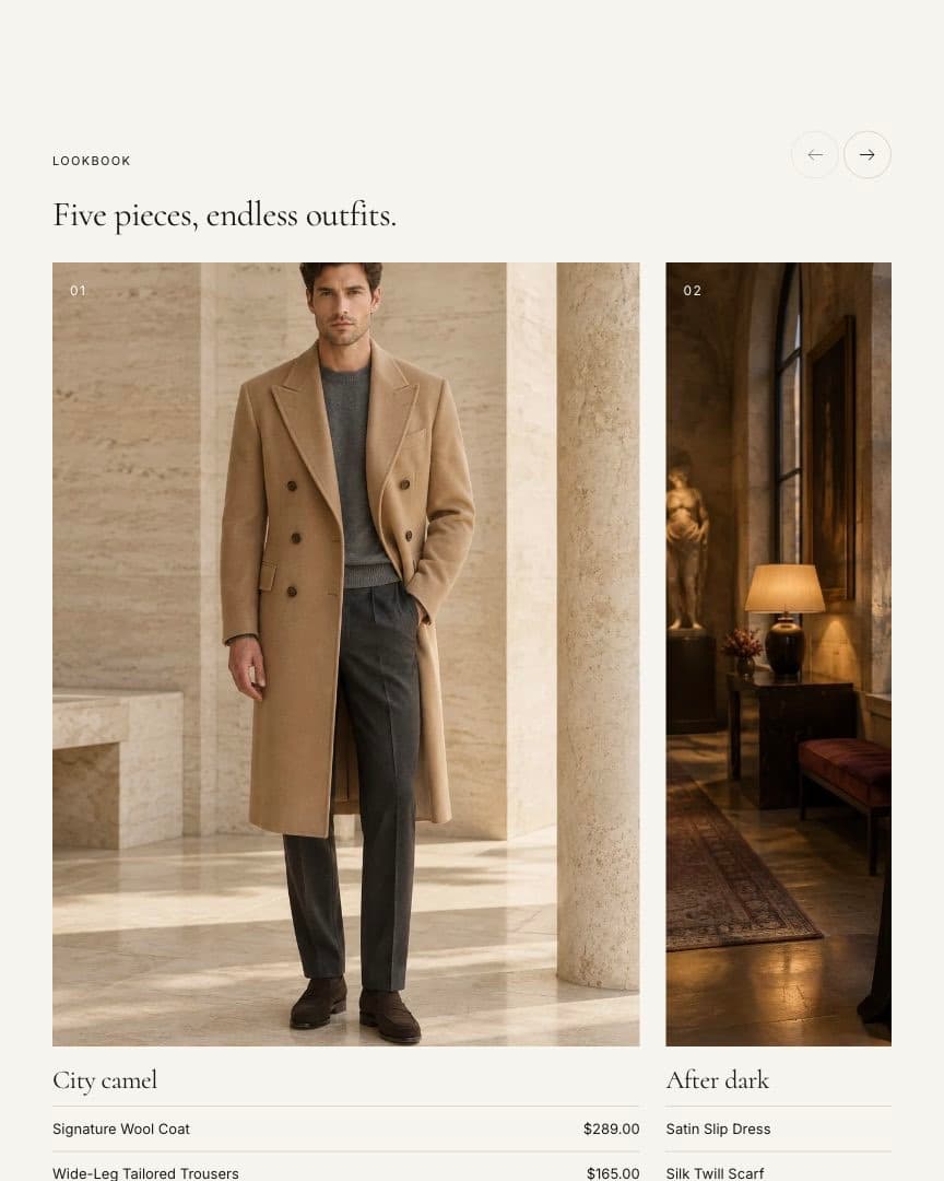
| Lookbook | Editorial looks with products. | Add Look blocks. |
Storytelling
| Section | Use it for | Setup notes |
|---|---|---|
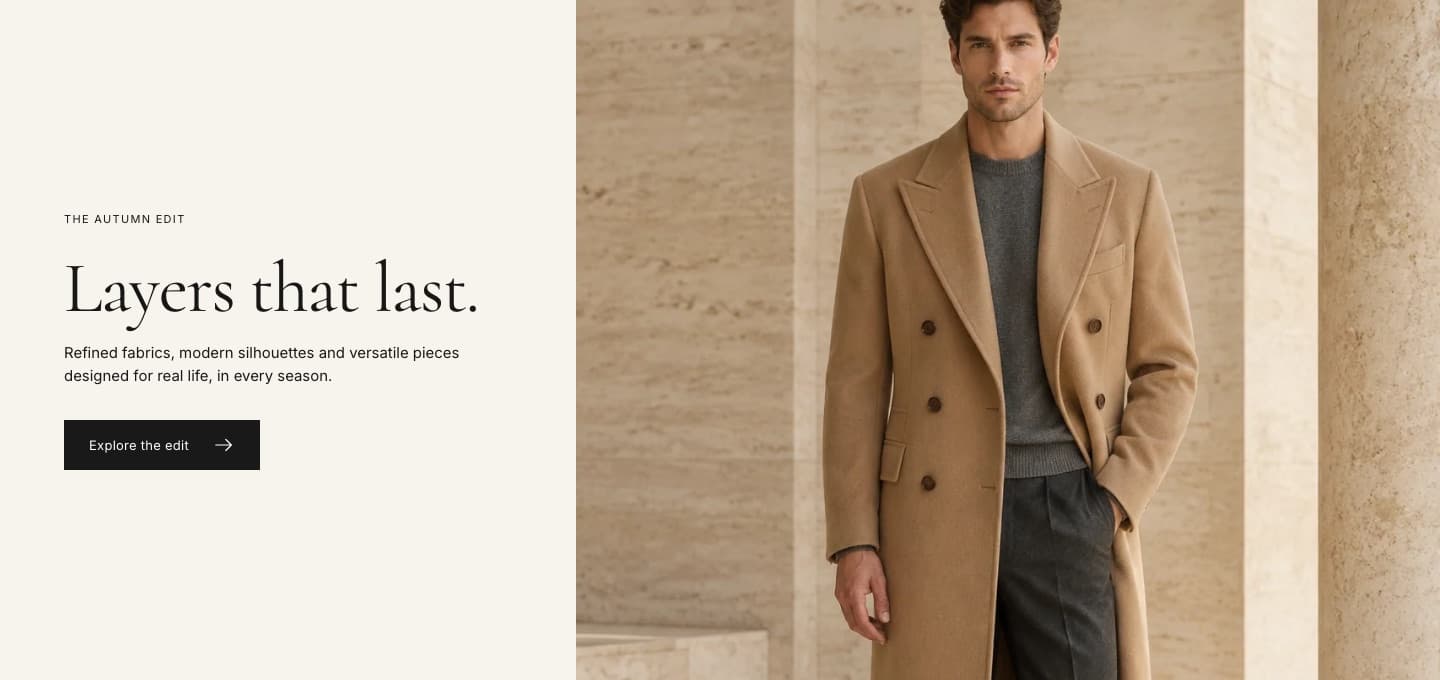
| Editorial | Image beside text and a button. | Image width, height, alignment and mobile order are adjustable. |
| Story | Brand story with a main and a detail image. | Accepts theme blocks and app blocks. |
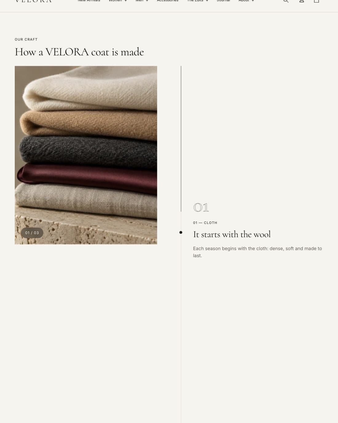
| Scroll story | Chapters that scroll beside a pinned image. | Add Chapter blocks. On mobile each chapter shows its own image. |
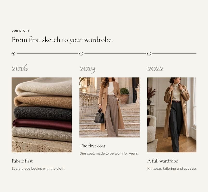
| Timeline | Milestones in order. | Add Milestone blocks. |
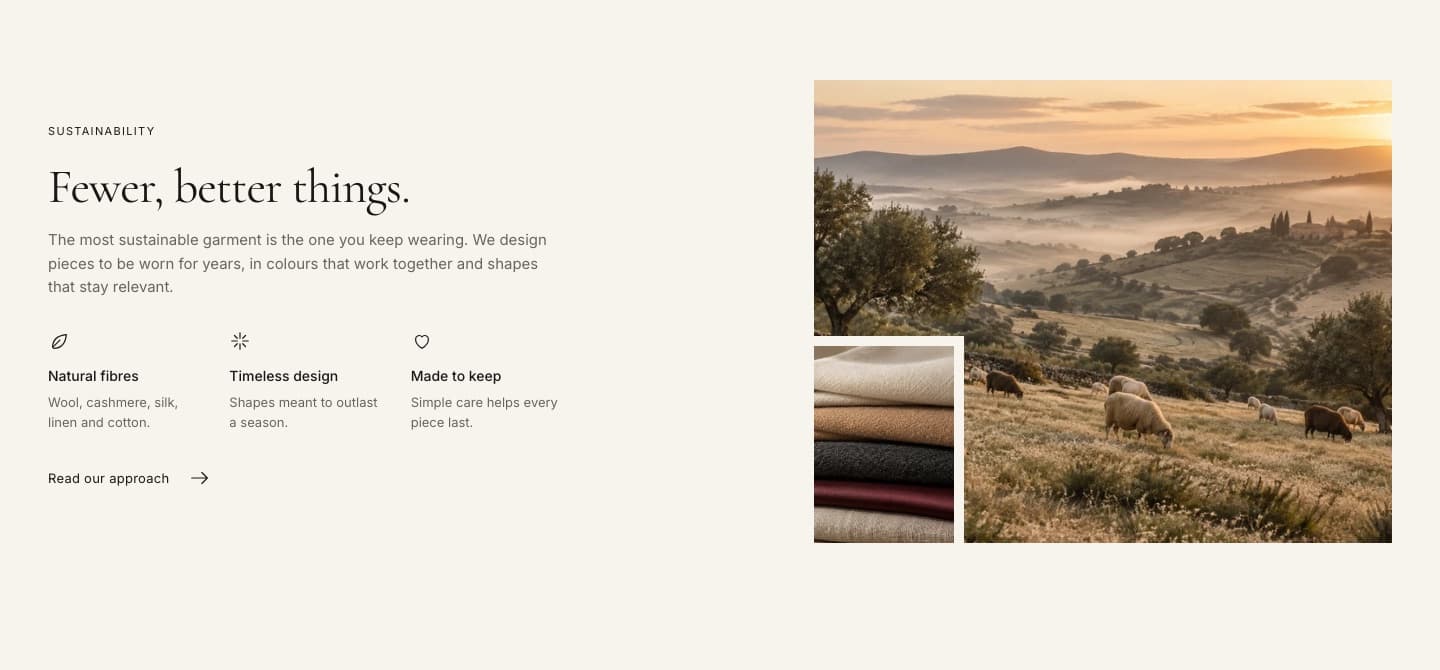
| Rich text | A statement, quote or short text. | Styles: Statement, Split, Editorial. |
| Image collage | Several images, collections or products in one composition. | Add Image, Collection or Product blocks. |
| Gallery | A grid of images. | 2–4 columns, staggered or mosaic layout, captions, numbering and a full-screen viewer. |
| Video | Uploaded, YouTube or Vimeo video. | Add a cover image so the video only loads when played. |
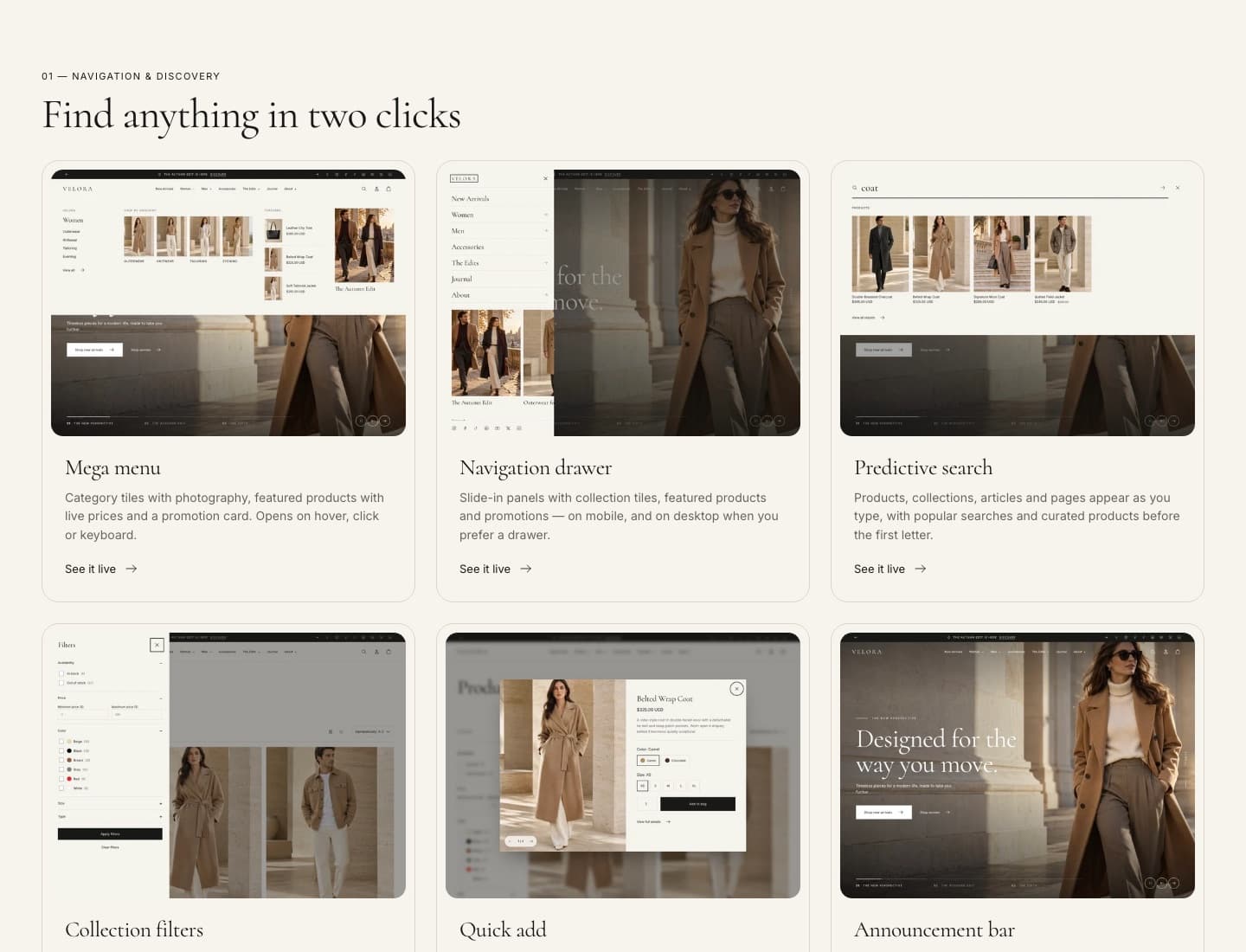
| Multicolumn | Cards with image, text and link. | 1–4 columns; the whole card is clickable when linked. |
| Tabs | Content in tabs. | Add Tab blocks. |
Trust and information
| Section | Use it for | Setup notes |
|---|---|---|
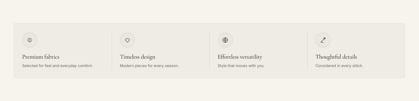
| Benefits | Shipping, returns, guarantees. | Layouts: Strip, Cards, Minimal. Each Benefit can have an icon and a link. |
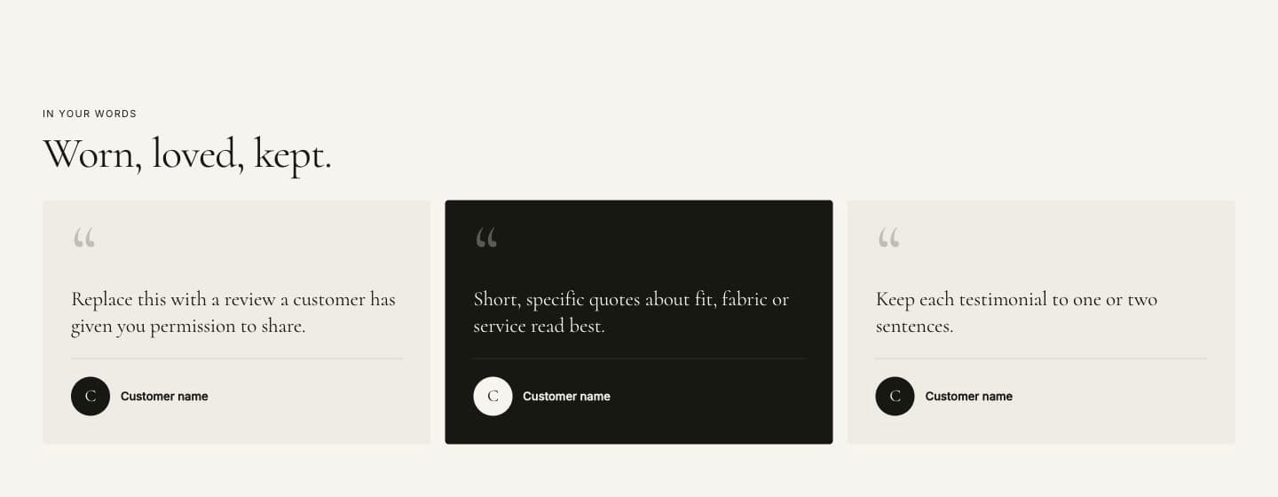
| Testimonials | Customer quotes. | Optionally link each testimonial to a product. Supports app blocks for review apps. |
| Logo list | Press or partner logos. | Grid or marquee layout. |
| FAQ | Questions and answers. | Optional help card with a button. Add FAQ structured data helps search engines show your FAQ. |
| Store information | Address, opening hours and map link. | Can show the store email and phone from your admin settings. |
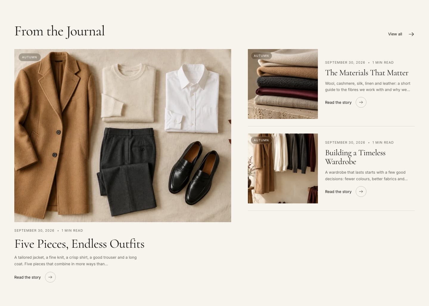
| Featured blog | Latest articles from a blog. | Editorial layout shows one large article with a list. |
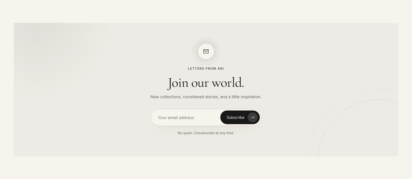
| Newsletter | Email sign-up. | Uses Shopify customer forms. Subscribers appear in Customers with email marketing consent. |
Promotions
Sale countdown, Gift card, Pop-up and Announcement bar are described in Promotions.
Advanced
| Section | Use it for |
|---|---|
| Custom section | Build your own layout from theme blocks (heading, text, image, button, accordion, icon, video and more) and app blocks. |
| Custom Liquid | Add Liquid or HTML code, for example an embed from another service. |
Note
Sections show only real data from your store. If a section is empty on your store — for example Recommendations or Recently viewed — it is because Shopify has nothing to show yet.