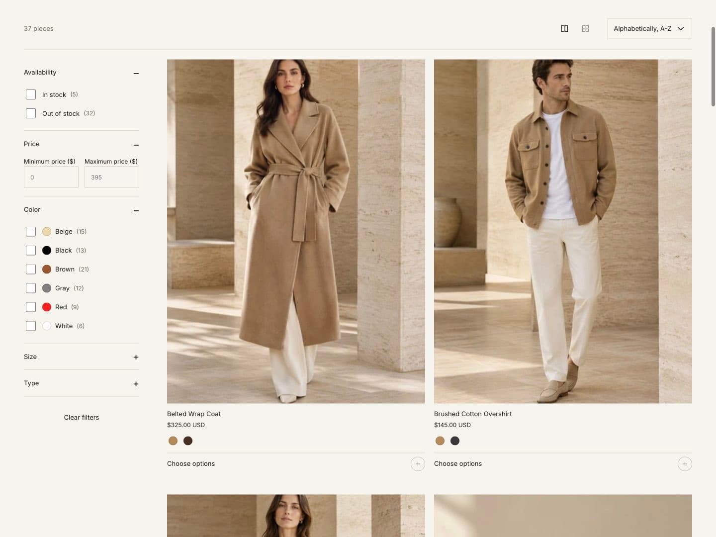
Product page
Open a product page in the theme editor (page selector › Products › Default product). Changes apply to every product that uses this template. To give some products a different layout, create a new template with Create template and assign it to those products in the admin.
Product section settings
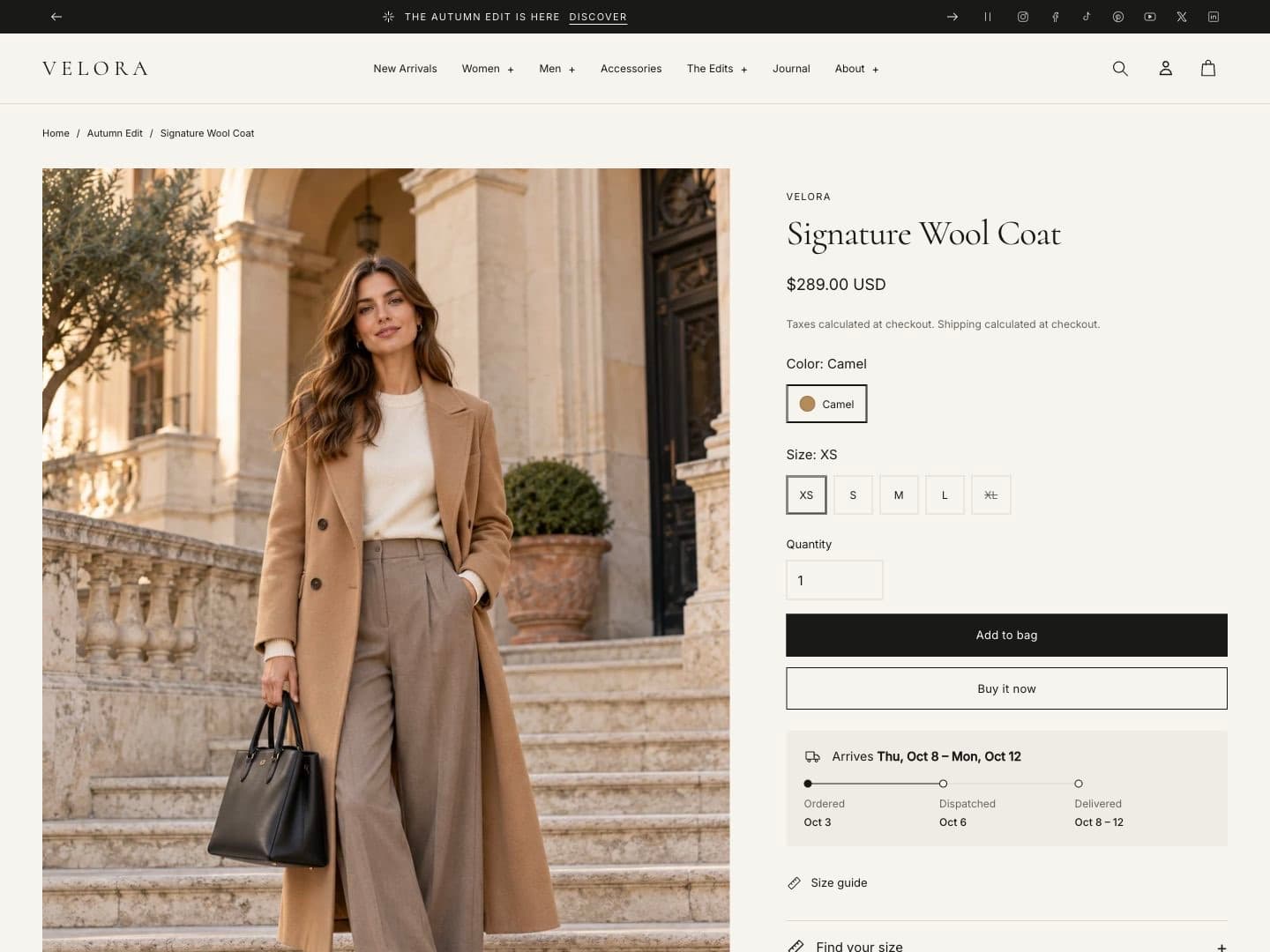
| Setting | Options |
|---|---|
| Media gallery layout | Editorial, Stacked, Thumbnails, Large media, Slider with thumbnails, Vertical thumbnails |
| Media aspect ratio | Natural, Square, Portrait 4:5, Landscape |
| Media fit | Fill or Contain |
| Desktop media width | Share of the page used by the gallery |
| Product information position | Right or Left of the gallery |
| Product information style | Plain, Panel, Bordered |
| Product information alignment | Left or Center |
| Product title size | Small, Medium, Large |
| Enable image zoom | Opens images at full size in a viewer |
| Sticky product information | Keeps the product information in view while scrolling the gallery |
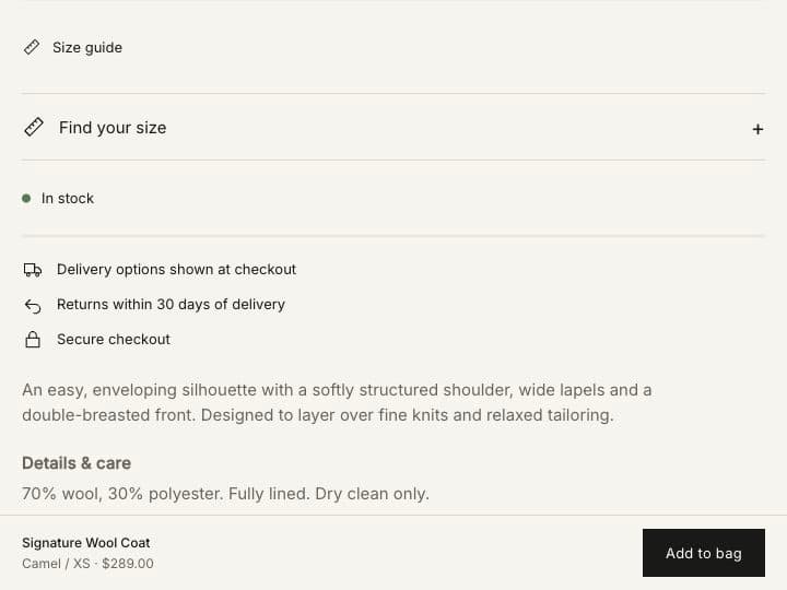
| Show sticky add to cart on mobile | A compact add to cart bar on phones |
| Show vendor / Show breadcrumbs | Shows the brand and the page path |
When a customer picks a variant, the gallery shows that variant’s image. Assign images to variants in the product admin.
Product blocks
Add, remove and reorder blocks inside the Product section.
| Block | What it does |
|---|---|
| Title, Price, Description | Product data from the admin. |
| Buy buttons | Variant options, quantity and add to cart. Show accelerated checkout adds Shop Pay, Apple Pay and others. |
| Product details | A collapsible row with the product description. |
| Accordion | A collapsible row with your own text or a page’s content, for example care instructions. |
| Countdown timer | A timer for a sale. Can show only when the variant has a compare-at price. |
| Pickup availability | Local pickup availability from your locations. |
| Delivery estimate | Shows when the order will arrive. See below. |
| Fit finder | Recommends a size from a measurement. See below. |
| Inventory availability | In stock, low stock or out of stock. Can show the tracked quantity. |
| SKU | The selected variant’s SKU. |
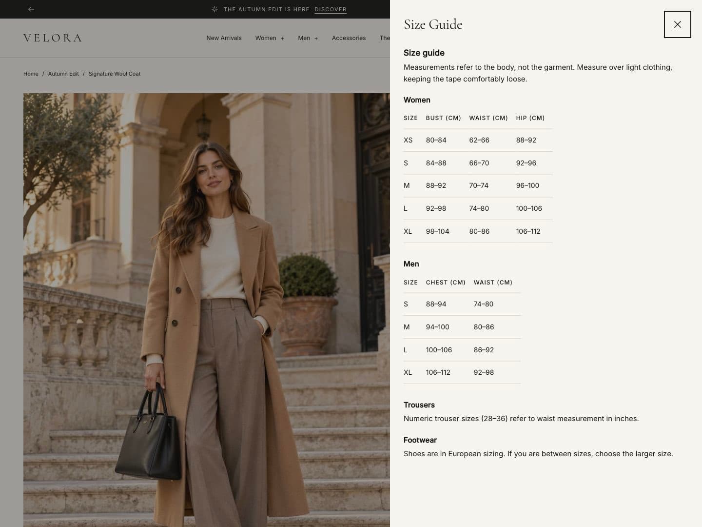
| Size guide | A link that opens a page with your size chart. Hidden on gift cards. |
| Complementary products | Products you set as complementary in Search & Discovery. |
| Service icons | Up to three icons with short text, such as delivery or returns. |
| Share link | Copies the product link. |
| Text, Custom Liquid | Your own text or code. |
| App blocks | Blocks from apps you installed, such as reviews. |
Delivery estimate
Shows a timeline from order to delivery, for example “Order within 2 h 15 min — arrives Thu, Oct 8 – Mon, Oct 12”.
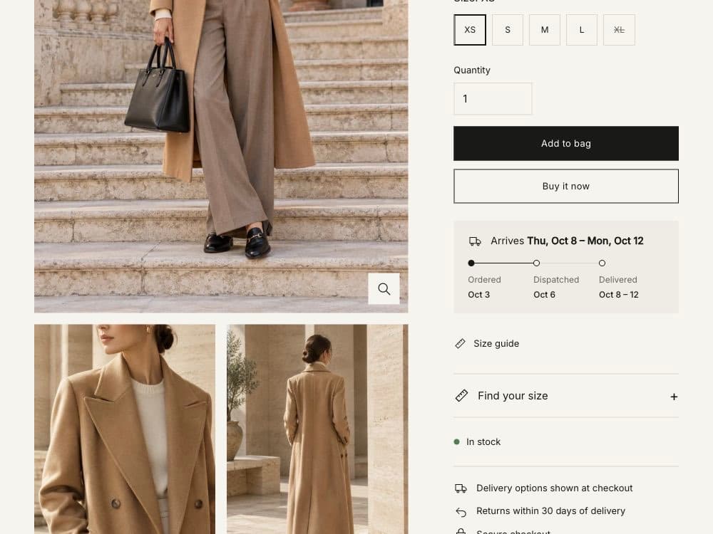
| Setting | What it does |
|---|---|
| Same-day dispatch cutoff | The hour (store time) until which orders ship the same day. |
| Processing days | Working days before an order ships. |
| Delivery days (minimum / maximum) | Shipping time range. |
| Dispatch and deliver on weekends | Counts Saturdays and Sundays as working days. |
| Non-shipping dates | Holidays when you do not ship. |
| Note | Short text under the estimate. |
The estimate is hidden for gift cards and products that do not need shipping.
Fit finder
The customer enters one measurement and Ani recommends a size.
- Size option name: the option that holds sizes, usually
Size. - Measurement and Unit: for example Chest, cm.
- Size ranges: one per line, as
size: from-to, for example:
S: 84-89
M: 90-95
L: 96-101
The recommended size can be selected in the product form with one tap. Between two ranges, the larger size is suggested. The block only appears on products that have the named option.
Variant options and swatches
Choose buttons or drop-downs for options in Theme settings › Swatches and options. Color swatches use the Color category metafield: connect the Color option to it in the product admin. See Product cards.